|
© by
This e-mail address is being protected from spambots. You need JavaScript enabled to view it
unless noted otherwise - exclusivly licensed to opticallimits.com
Of vital importance for faithful color rendition is
to take into account the color of the illuminant (incident light) in the
scene.
When you put on a pair of colored sunglasses, all that you see
becomes temporarily tinted. The same things happen when you enter a room lit by
colored lights. From previous experience, the brain knows what colors common
objects such as trees and clouds and human skin have and the visual system
gradually adapts to the new illumination conditions, and colors seem normal
again. The way the brain adapts to different lighting conditions is mimicked in
the (automatic) white balance function of digital cameras.
Referring to
the CIE chromaticity diagram for the XYZ color system, a collection of points
(geometric locus) can be defined that describe the perceived color of a heated
black body (a non-reflective black object). The curve formed by these points is
known as the Planckian locus.
In essence, as the temperature of the black
body increases, the light it emits changes from red to yellow to white and, for
very high temperatures, to blue. Upon these observations, the temperature of a
color (usually referring to a light source) is defined as the temperature at
which heated, the black body emits light of that color. The notion of color
temperature is somewhat non-intuitive, because we usually refer to bluish colors
as cool and yellow-reddish ones as warm. With color temperature it's the other
way around. In the diagram below, the straight lines represent the direction of
the colors of equal temperature. All the colors on the, say, 6000K line have the
same color temperature but the proportion of green and magenta is what sets them
apart. The scale on the right approximately illustrates the color temperature of
various common illuminants (light sources).
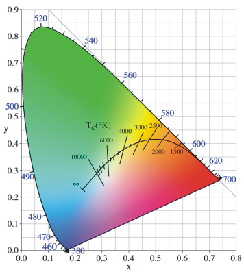
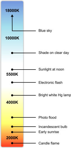
Diagram on left
reproduced under GNU public
license
In photography the range of illuminants is quite large.
Think of the light emitted by a sunset, an overcast sky or a halogen bulb. By
what is called white balance the proper compensation for the color of incident
light can be applied so that the image will ultimately look like the subject was
illuminated by white sunlight (roughly equivalent to 6000 K). There of course
cases like shooting neon lights or fireworks, or for special photographic
effects, when you would want to keep the color of the incident light, fully or
partly.
So what happens when you change the white balance either in
camera or from the RAW processing software?
The auto white balance (AWB)
function analyses the composition of the scene and compares it to a set of
reference metrics stored in the camera's processor and selects the set of
parameters most suited to that scene type. The outcome of this process is that
the camera will roughly know what scene type it is looking at and what the
colors should be. As a consequence it will shift the white point on the
Planckian locus and the green – magenta proportion of all the colors to achieve
a similarity between the WB corrected image and the internal reference image
that it has selected as a model.
Preset white balance settings work in a
similar fashion except that the scene is not analyzed, but instead the colors
and the white point are shifted using predefined values.
That ‘set white
balance feature' present on a large number of cameras lets the user effortlessly
create a white balance profile to match the exact lighting conditions. What is
needed is a white or neutral grey (preferably non-reflective) card lit by the
respective illuminant that the camera while measure. This essentially involves
holding the card in front of the lens so that it covers the center of the image
and pressing the set white balance or equivalent button. The camera will then
analyze the image (and the color it will see will most probably not be pure grey
but it will rather be a more or less saturated hue) and compensate so that after
processing the patch will look grey. This method of achieving proper white
balance yields remarkably good results due to the fact that it completely
removes the influence of the colored incident light, effectively making the
picture look as if the scene was illuminated by noon sunlight (white light).
Achieving proper white balance in a scene in which multiple light sources of
different types (color temperatures) are present can be quite tricky but at the
same time these scenes are quite spectacular subjects. As an example, the
following picture of below average artistic value of a fairly known piece of
white marble illustrates how white balance can change the look and mood of an
image.
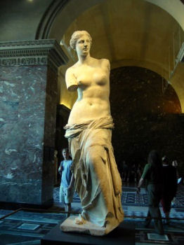
To
the right and back of Venus was a window that let in white sunlight and the
reflector light was quite orange. By choosing white balance setting that turned
the yellow light whiter, the proper white light illuminating the background was
made bluer. Of course, tastes vary, but in general, a white sculpture with a
bluish background is more appealing than a yellow tinted sculpture on a white
background.
Most problems with white balance appear because in many cases
incident light does not come from a black body heated to incandescence (e.g. the
Sun). The assortment of lighting fixtures that give of white-ish light we have
today have a discrete band emission spectrum. The incident light might also be
reflected from colored surfaces. All this implies a greenish or magenta
deviation from the Plankian locus. The purpose of the
tint
control in most RAW converters is to enable the photographer to compensate for
this deviation in addition to changing the color temperature. As it is, in-
camera AWB algorithms might be very suited for some lighting situations but
terrible at handling others.
When color goes
digital
The light spectrum is infinitely divisible, meaning that
if you chose two spectral colors, there are an infinite number of colors between
them. When it comes to color representation that poses a problem and, as no-one
is seriously thinking about storing an infinite amount of data, unnecessary
complexity needs to be removed. For digital systems, this is done by sampling
the color space, turning it from a continuous space to a discrete one.
Considering MacAdam distances (discrete colors should not be farther apart
than the minimum perceivable difference) and storage requirements, it was
concluded that 16.7 million discrete colors across a RGB color space would be
enough. This number is in fact in 2^24, or more precisely 2^(8+8+8) with each 8
standing for 8 bits of data for each primary color.
We refer to the
number of discrete colors that a color space is divided in as
color
depth.
In the above case (which is the norm for digital images), the
color depth is 8-bit or alternatively 24-bit (3 times 8).
8-bit color
depth is quite adequate for most capture-store-display situations where sRGB is
used. When working with larger gamut color spaces keeping the same color depth
results in larger granularity. This in turn might lead to posterization (the
transformation of uniform gradients to tonal steps), which can also occur when
aggressively manipulating images in small-gamut spaces. At the expense of memory
and processing power, colors can be represented with 16 bits per channel,
resulting in a color depth of 16 bits (or 48 bits). By working with an extended
color depth, the above effects are all but eliminated.
To show the
limitations of 8-bit color, the example below illustrates how a large-gamut and
a small-gamut imaginary color space would be chopped into discrete colors using
8-bit and 16-bit precision. The differences are exaggerated to prove the
point.
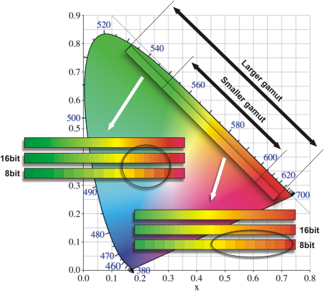
Suppose that the image of interest contains a sunset with
lots of close orange shades. When working with the narrow-gamut color space and
8-bit depth, there are plenty of orange shades. Let us assume that there are
enough of them so that no posterization occurs.
If we keep the 8-bit
color depth but switch to the larger-gamut color space, the range of oranges is
immediately reduced because more bits are needed to represent greens and reds.
In order to achieve the same gradation for our orange shades, we need to switch
to 16-bit depth. The example also shows that switching to 16-bits in the
smaller-gamut space does not improve the situation.
|