|
© by
This e-mail address is being protected from spambots. You need JavaScript enabled to view it
unless noted otherwise - exclusivly licensed to opticallimits.com
Visible light is a kind of electromagnetic wave. It would not
be a particularly exciting kind, hadn't it been the one for which our eyes are
tuned. The human eye is like the antenna of a radio receiver except that it is
sensitive to a different frequency band. We can see light in having a wavelength
from around 380nm to roughly 700nm. This band of wavelengths is called the
visible spectrum and is flanked by ultraviolet radiation (the favorite of beach-
goers worldwide) and infrared (which we ourselves generate in the form of body
heat).
In the first part of this article we'll be discussing color
theory, faithful color representation being the subject of subsequent parts.
The human visual system and color perception
characteristics
A significant part of this section was
inspired, both in content and in presentation, from the course on Television
Systems of Prof. Burlacu that the author has attended several years ago at the
‘Politehnica' University in Bucharest.
Even before we
begin any debate on color theory, a very important point needs to be
reminded.
Color theory is based on the properties of the
human visual system (HVS), therefore, the scientific notions involved always
relate to the way humans perceive color.
While the
earliest observations on light and color can be traced back more than 2000
years, the work of Thomas Young, J. C. Maxwell and H. von Helmholtz, who were
among the 19th Century's authorities on light, established the principles of the
mathematical theory of color. Maxwell is credited with the foundation of the
trichromatic theory, which states that any color can be obtained by combining,
in various proportions, three conveniently chosen primary colors.
The
choice of primary colors is what links the theory with the physiology of the
HVS. The eye's light sensor, the retina, is composed of two types of light-
sensitive cells.
Rods, the cells of the first type are sensitive to light
intensity and are what we use to perceive shapes and contours. The other kind of
cells, cones are responsible for color vision. There are three subtypes of
cones, the difference between them being the wavelength selectivity, or primary
color for which they are tuned.
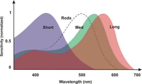
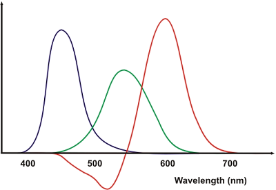
As shown in the diagram, the
cones for short (S), medium (M) and long (L) wavelengths are most sensitive to
blue (B), green (G) and red (R) respectively.
As a side note, the
sensitivity of the respective cones to red, green and blue is not equal. That is
to say the quantity of light necessary in order to produce the same sensation of
intensity is different for S, M and L cones.
Returning to the
trichromatic theory, it is only natural to chose R, G and B as the primary
colors, as these three best fit the receptors in our eyes and thus, when mixed,
produce the whole range of visible colors. Having said that, any three colors
can be used as primaries, but by not choosing them ‘conveniently', the range of
colors that may be obtained by mixing is limited.
Color mixing
When it comes to mixing colors in order
to produce a new one, there are two approaches.
Subtractive color mixing
uses light filters to remove the unnecessary colors present in the incoming
radiation. For most purposes white or quasi-white light is used, as it contains
all the colors of the spectrum. This approach is objective, in the sense that by
filtering, you get a certain color only if the incoming light contained that
color. For example, by using green light and a red filter, you would not get
red, as red is not part of the initial green light.
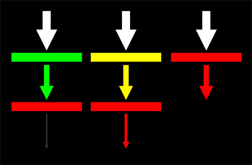
Filters can be stacked,
the result being that only the wavelengths that are common to all of the
filters' transmission spectrums are let through.
Two major types of light
filters are used. Transmissive light filters (e.g. colored patches of glass or
plastic) stop some of the wavelengths from the incident light, only letting
trough a limited range of colors. Reflective light filters such as paints, dyes
and pigments absorb the unwanted wavelengths, reflecting back only some of the
colors.
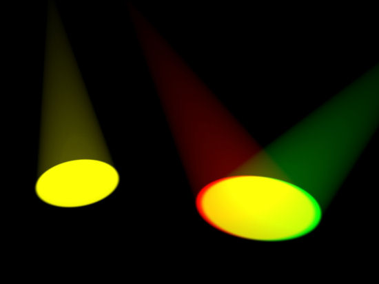
The second approach to color mixing is called additive and
uses several light sources of different colors to create the
sensation
of another color.
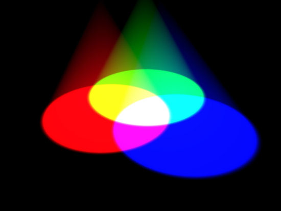
For instance, by combining red and green one
gets yellow. The yellow resulting from the combination of red and green light
gives the same visual sensation as the yellow produced by spectrally pure yellow
light. Additive mixing is said to be subjective, meaning that only the sensation
is the same; the color obtained by mixing is not present within the combined
spectrums of the incoming light.
In practice,
there are several ways of obtaining colors by additive mixing, all of them
relying on specifics of the human visual system.
- Optical additive
mixing combines two or more colors on the same surface at the same time. This is
the technique used in older video projectors.
- Spatial color mixing
relies on the finite resolution of the human eye. From a distance, two dots of
different color are perceived as one dot the color of which is the combination
of the actual dot colors. Spatial mixing is the basis of color monitors that use
color cathode ray tubes.
- The third way of mixing colors by adding them
together is called temporal additive mixing. Two or more colors are combined on
a surface, but at different moments in time. Given the fact that the human
visual system can process information at a finite speed, combining primary
colors at a higher rate gives the sensation that the primaries were displayed
simultaneously. Therefore the subject has the visual sensation of colors that
were not present among the primaries. Modern digital projectors use this
approach.
The Color Matching
Experiment
Using R, G and B as primaries, experiments were made
regarding the subjective nature of additive color. Subjects were asked to
spatially combine R, G and B light in different proportions in order to obtain
the same visual sensation as from a separate, reference color, a process called
color matching. By repeating the experiment with different reference colors
chosen form the visible spectrum it was possible to come up with mathematical
descriptions of all the colors of the spectrum based on the relative amounts of
R, G and B needed to obtain the same visual sensation. The results, which are
average for a group of observers, are graphically represented in the image
below.
One interesting result is that for some reference colors
red is not added to the mix of primaries but to the reference color itself in
order to obtain the same sensation by combining the two remaining primaries.
This is shown by the negative values for the proportion of red. Another thing to
note is that by selecting different values for the wavelengths of the primary
colors yields different color matching curves.
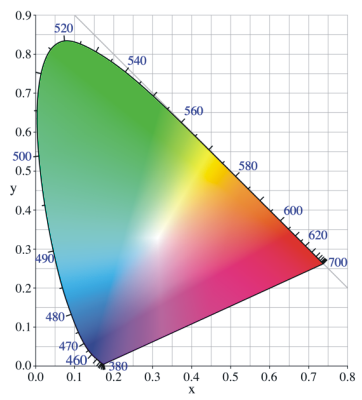
Colorimetric systems
The color matching test
produces a description of colors visible to humans in terms of the proportion of
the R, G and B primaries necessary in order to obtain the same visual sensation.
Over the years, several colorimetric systems, ways of classifying and
identifying colors by specific attributes, have been developed. The chromaticity
diagram developed in 1931 by the International Comission for the Illumination
(CIE – Comission Internationale pour l'Eclairage) is still a widely used tool
when it comes to color spaces.
By using the values from the color
matching diagram it is possible to plot into three-dimensional space the
position of all the colors in the spectrum, having the amount of red (R), green
(G) and blue (B) on the three axes respectively. The origin (O) is the black
point where there is no red, no green and no blue.
|
Briefly, the CIE
1931 chromaticity diagram is formed in the following way:
- The 3D
RGBO color space is normalized to rgbO, with r = R / (R+G+B) etc.
- An
irregular cone is formed using O as its tip and the curve formed by plotting the
spectral colors in rgbO as its base. This cone is then intersected with the
(1,1,1) plane
- The intersection is projected on the rgO plane using the
assumption that since the space is normalized (r+g+b=1), b can always be derived
from b=1-r-g. The resulting shape is called the Wright-Guild diagram or the
horseshoe in more familiar terms.
- The horseshoe has one major drawback
in the fact that there are regions of the diagram for which the coordinates in
the rgO plane are negative. This matter is resolved by creating a new coordinate
system within the rgO plane. The new coordinates x and y are not orthogonal when
created, but the diagram is stretched so that in the end x is perpendicular to
y. The y axis is chosen proportionally to perceived brightness in the Wright-
Guild diagram.
|
Image
is public
Observations on the CIE 1931 chromaticity diagram:
- The point where x = y = 1/3 is called the reference white (E white).
- The coordinates x and y are artificial. They do not represent real
colors in themselves.
- The CIE 1931 chromaticity diagram represents all
visible colors at full luminance.
- It is part of the CIE-XYZ color
space. Think of the diagram as the top slice of the CIE-XYZ color space. Other
slices have colors with the same hue and saturation, but darker. These other
slices are stacked on the z axis.
|