|
© by
This e-mail address is being protected from spambots. You need JavaScript enabled to view it
unless noted otherwise - exclusivly licensed to opticallimits.com
Color management is the concept that scares a lot of
novices resulting in faulty color rendition and even more frustration with color
management. This section aims to offer some no-hassle guidelines for achieving
adequate results. But first, the nerd bit.
For digital imaging, color
management is the collection of techniques applied in order to obtain consistent
color reproduction across all the devices.
|
Take any color in
the horseshoe diagram. It will always be the same no matter what name you
attribute to it because it will be situated in the same point in the diagram, in
other words it will have the same xy coordinates. Now when you define a color
space within the horseshoe diagram, you identify the colors in that color space
by a row of numbers. These numbers represent the proportion of each primary
color that is needed to obtain the color in question and are equivalent to the
color's ‘name' in that space. Because each color space will have its own
primaries, that same color will have different ‘names' in each space.
There will be cases when a color (C) will be within the gamut of color space
A but not in that of space B. It will have no ‘name' in color space B. So what
becomes of color C when we absolutely need to work in color space C?
In
practical photography this business of colors being outside the gamut of the
‘final' space happens quite frequently actually. And the reason for this is that
the different pieces of hardware have different gamuts, usually based on their
constructive principles. The issue of most interest to photographers when it
comes to color management is to be able to make a picture on the screen and the
printout of the same picture look as close to identical as possible.
Whether the user is aware of it or not, the color managed workflow inside the
image editing software goes something like this:
- The software
converts the image from its associated color space (if any) to the working color
space;
- The software converts the image to the monitor color space for
display;
- The software converts the image to the printer color space
for printing.
As can easily be seen, ‘the software' does a lot of
converting and to do it right it needs to know what the potential of each device
are in terms of color representation (i.e. gamut etc). These capabilities are
stored in the device specific ICC profiles (files that represent the device's
gamut and other specific parameters such as gamma for monitors). Device-
independent ICC (by the way this stands for the International Color Consortium)
profiles also exist, describing in this case reference color spaces such as sRGB
or AdobeRGB.
The routines responsible for color management are called CMM
- color matching module (or engine). CMMs perform basically the same actions,
but each manufacturer names its own differently. Adobe's CMM is called ACE –
Adobe Color Engine; the one from Microsoft is named ICM, standing for Image
Color Management, now at version 2.0; Apple makes ColorSync. Of course, a myriad
of alternative color matching modules exist from various publishers.
The
CMM uses the ICC profiles of various devices to perform gamut mapping -- the
process through which the colors of an image are translated from the source
color space to the destination) color space. In order for gamut mapping to work,
the two color spaces need to have something in common and that something is the
reference color space also known as a profile connection space (PCS). The PCS is
usually CIELAB but can also be CIEXYZ. (How's that for an acronym tirade?) The
reference color space is larger than any of the two spaces involved in the
conversion and it acts as a temporary unique system coordinates.
In the
‘make my prints look like my screen' situation described before, the profiles of
the printer and the monitor are both used to achieve consistent results. It is
the job of the CMM to ensure that the colors present in the working space have a
correspondent on both media (and that the correspondents are close enough in
appearance on both the printout and the screen). The issues that color
management solves arise precisely from the fact that devices of different types
tend to have differently ‘shaped' and sized gamuts when represented in the PCS.
If color management is not performed (device ICC profiles are not taken into
account), results may range from slightly color shifted to unusable, depending
on the relative shape and size of the two spaces.
|
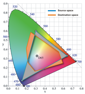
An
example of two arbitrary color spaces is shown below, with shaded portions of
the diagram illustrating the colors that can be represented in one space but not
in the other, respectively.
The several ways that the software can treat
mismatches between the source and destination color spaces are rightly known as
rendering intents. Each one is appropriate for a limited set of conditions.
There are four rendering intents, and only two are of actual interest for
digital photography. We'll get the others out of the way first:
- Saturation rendering intent (called Graphic by Microsoft) is usually used in
presentations and business graphics to ensure that colorful charts and graphs
remain pleasant to look at, by mapping primaries in the source space to
primaries in the destination space. This has the effect of altering the color
hue (obvious) but possibly also lightness and is particularly helpful in
eliminating annoying dithering effects for colors that would have otherwise been
very close but not 100% saturated in the destination space.
- Absolute
colorimetric (Microsoft's name is Match). Colors that fall within the gamut of
both spaces are preserved, while colors in the source space that fall outside
the destination space are clipped to the closest reproducible color. This
rendering intent does not preserve the white point, introducing a distinctive
color tint in the converted image and thus not being of real use to
photographers. Clipping hues makes this process irreversible.
- Relative
colorimetric (Proof) is quite similar to absolute colorimetric in that colors
common to the two spaces are mapped one-to-one and those outside the
destination's gamut are clipped to the nearest in-gamut color, but the white
point of the image is also preserved. As this intent implies the clipping of
saturated colors in the source space, it also is irreversible.
- Perceptual (Picture) is the most widely used rendering intent. Regardless of
the sizes and shapes of the two color spaces, the source's gamut is stretched
(either way) to cover the destination space (and no more) completely. This
transformation is in theory reversible, as no information is lost along the
edges, but due to the finite granularity of the two color spaces, a better
result can be obtained if the color resolution is increased (to 16 bits per
channel) for both the direct and the reverse conversion and no going back to
lower color resolution between conversion is performed.
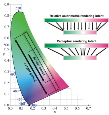
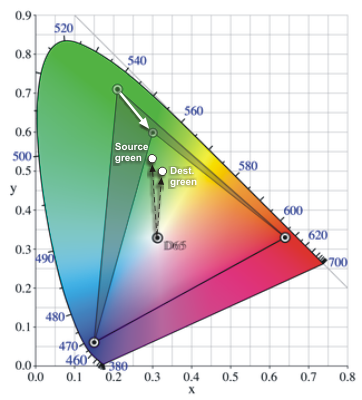
The
figure below shows the effect of applying relative colorimetric and perceptual
intents to a conversion between two virtual 2-dimensional color spaces
Having established that Relative Colorimetric and Perceptual are the two
rendering intents most appropriate for digital photography workflows, we shall
now discuss which one is more suited for what purpose.
First rule of
thumb, if you want to be safe, use perceptual. The relationship between the
colors will still be there, but on the downside the visual effect may not be
that great. You might lose (or gain) contrast, saturation and worse still, in
some hues more than in others. As all images are different, for best results
each should be considered in turn.
The important distinction here is to
take into account the colors actually present in the image, not the size of the
source space itself. Think of the subspace occupied in their color space by the
colors the image uses. If this subspace fits entirely or almost totally in the
destination space, go with the relative colorimetric intent. In the diagram
above, you would be in the case where all or most of the lines are parallel and
little or no color information will be lost through clipping. This is also the
case when converting to a color space that completely surrounds the soruce
space.
However if there are a lot of colors in the image that cannot be
reproduced in the destination space, using perceptual intent is the better bet.
Working with relative colorimetric if a significant part of the color
distribution in the source falls out of the destination's gamut can destroy
detail (irreversibly) and can lead to patches of solid color where subtle detail
once was.
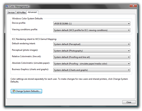
The good news is that most of the color management is done
automatically observing color space conversion rules that you can set. This is
usually done by using the ‘Color Management' or similar menu item from your
preferred image handling application, and setting the needed intent. Windows
Vista has a basic color management setup window for setting the system defaults.
It can be reached from Control Panel -> Hardware and Sound -> Color
Management. Attach device-specific profiles to the various output devices.
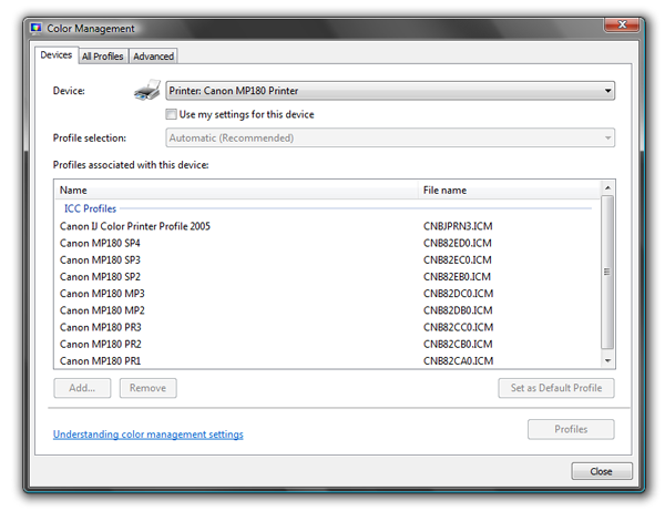
The Advanced tab, where rendering intents are set looks like this:
In
Photoshop CS2, the color management options are accessed via Edit->Color
Setting->More Options.
The following example, of questionable artistic
value but of undeniable natural beauty, shows the consequences of (mis-) using
rendering intents. In this case, the source space was AdobeRGB and the
destination the smaller-gamut sRGB. This is quite a typical conversion in the
not recommendable event of importing files shot in AdobeRGB to your imaging
processing software that uses sRGB as a working color space. The same things
happen when converting from the working space to the printer color space and the
chosen rendering intent is Perceptual. The point is that in this example, while
not catastrophic, the differences can be seen with the naked eye. In real life
you could end up with sub-par results if the rendering intent does not fit the
image.
|

|

|
|
A
|
B
|
The
image on the left (A) was shot in AdobeRGB and converted to sRGB using the
default (perceptual) rendering intent. The one on the right (B) was shot in sRGB
and was left unmodified. At this moment both images share the same sRGB color
space and your browser probably uses sRGB too, so the only difference between
them (apart from them being different shots) is that image (B) has more
saturated greens and cyans. But to achieve more saturated greens and cyans is
precisely why you would normally ditch sRGB in favor of AdobeRGB as an image
color space. So what is wrong with the images? In fact nothing is. By using the
Perceptual rendering intent in the conversion, the colors, especially in the
green-cyan area were squished so they fitted in the smaller color space.
The
sRGB image (B) has quite saturated shades of green and cyan but not very
saturated, or else they would not fit in the sRGB gamut. And the fact that you
are seeing them on screen is proof that they do fit. What is a quite saturated
green in sRGB is only moderately saturated in AdobeRGB. By squishing AdobeRGB
into sRGB, that moderate green becomes even less saturated (and again this
applies to all the colors in the blue-cyan-green range), hence the appearance of
image (A).
To summarize, this is a classic example of the results you get
when using Perceptual rendering intent for images the colors of which would
quite comfortably fit in the destination gamut as they are. In cases like this,
relative colorimetric is the way to go. Referring back to the example above, the
original AdobeRGB image converted to sRGB using relative colorimetric would be
indistinguishable from the image on the right (the conversion would faithfully
preserve the colors of the original).
|